Colours That Photograph Beautifully
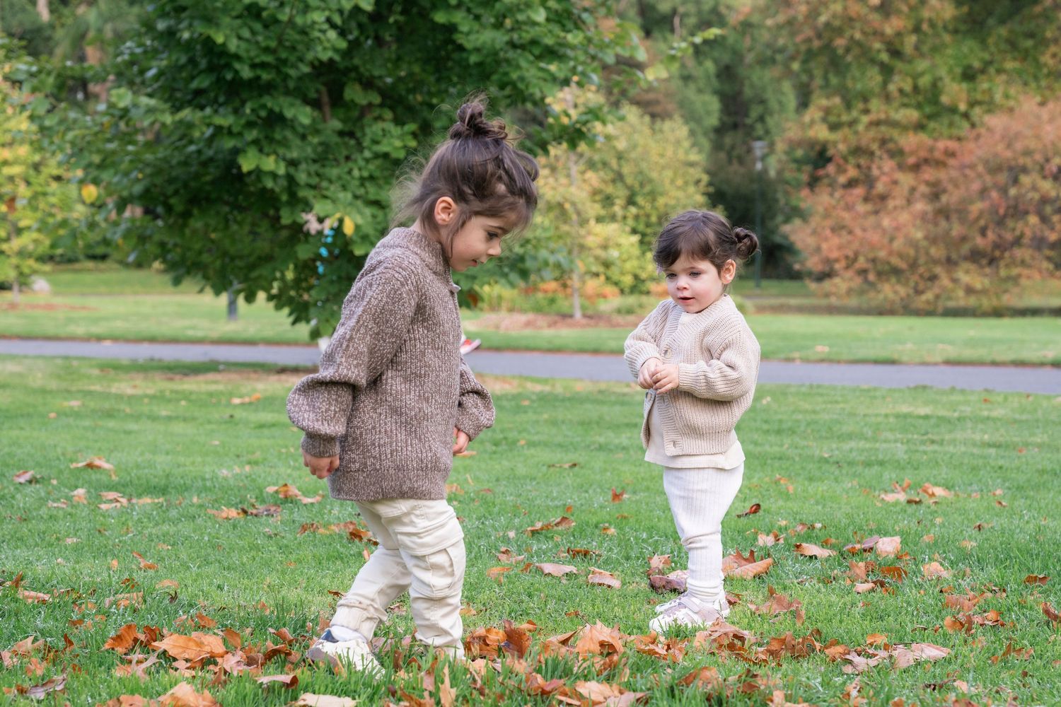
One of the easiest ways to elevate your photographs is by choosing a colour palette that works together. The goal isn't to match perfectly—it's to create a collection of colours that feel balanced, natural and true to your personal style.
The best outfits don't distract from the people in the photograph. Instead, they help your connection become the focus.
Where to Start
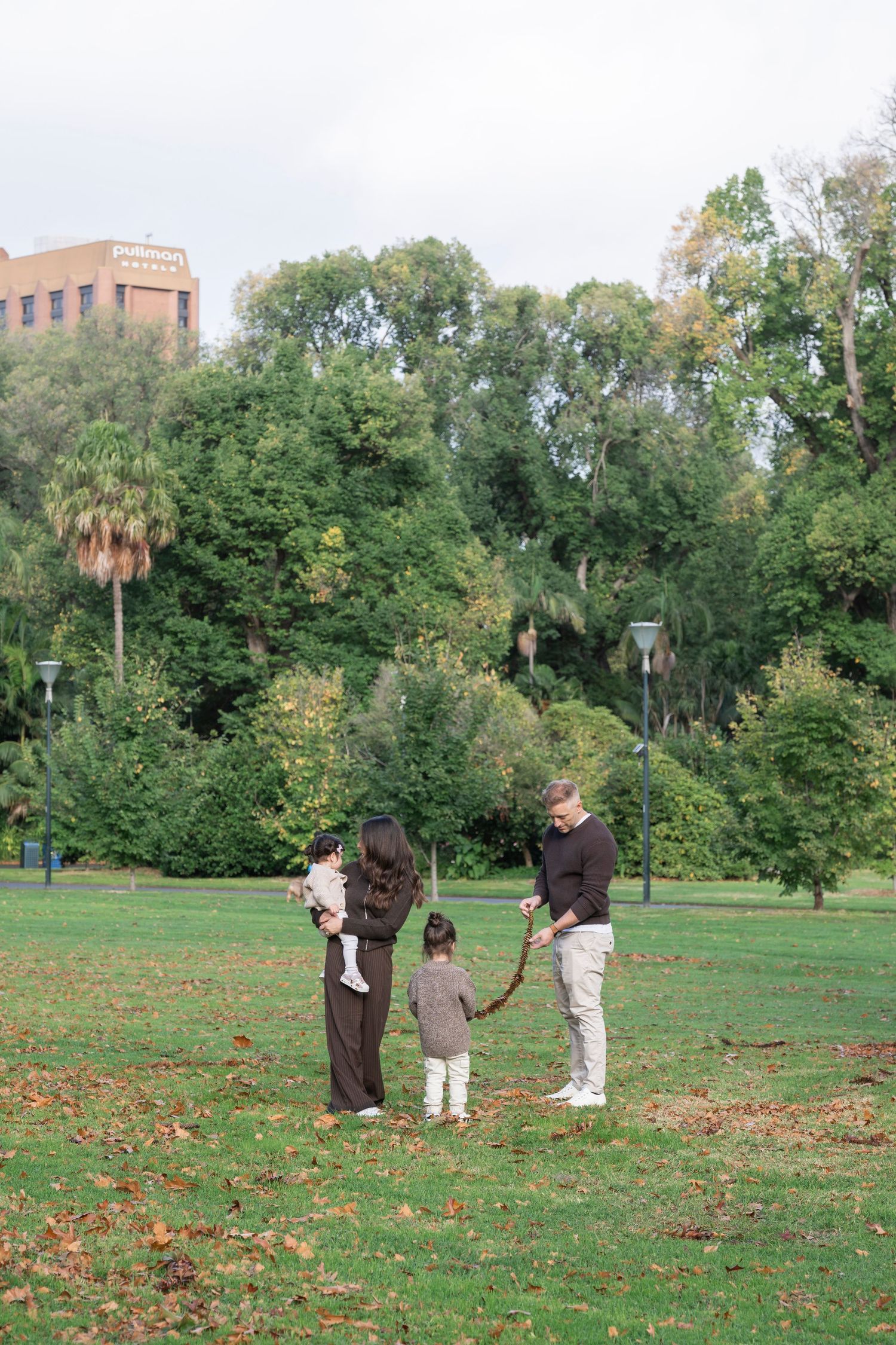
Start with Neutral Tones.
Neutral colours are timeless and photograph beautifully in almost every setting.
Some of my favourites include:
Cream, Oatmeal, White, Soft grey, Camel or Navy
These colours create a clean, natural look and pair beautifully with almost any location.
Add Earthy Colours
f you'd like to introduce a little more colour, earthy tones are always a safe choice.
Think:
Olive green, Sage, Rust, Terracotta, Chocolate brown, Dusty blue, Mustard, Burgundy
These colours add warmth and depth without overpowering your photographs.
Coordinate, Don't Match
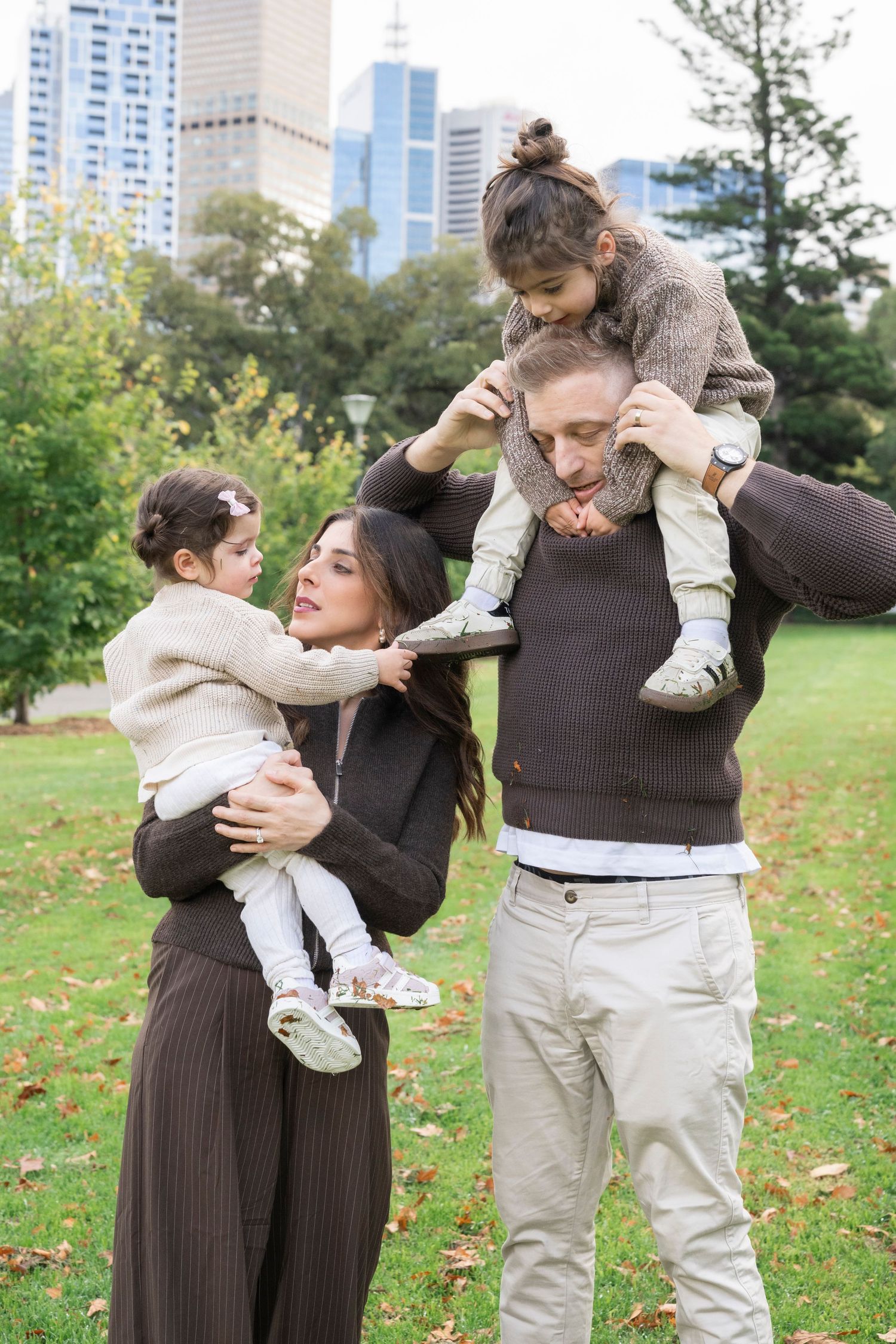
Rather than everyone wearing exactly the same colour, choose a palette of two to four colours that complement one another.
For example:
Cream • Olive • Camel
Navy • White • Soft Grey
Rust • Beige • Brown
Sage • Oatmeal • Denim
This creates a cohesive look while allowing everyone's personality to shine through.
Think About Your Location
The best colour palette often depends on where your session is taking place.
Beach
Soft neutrals, whites, creams, sandy tones and light blues work beautifully against the coastline.
Parks & Gardens
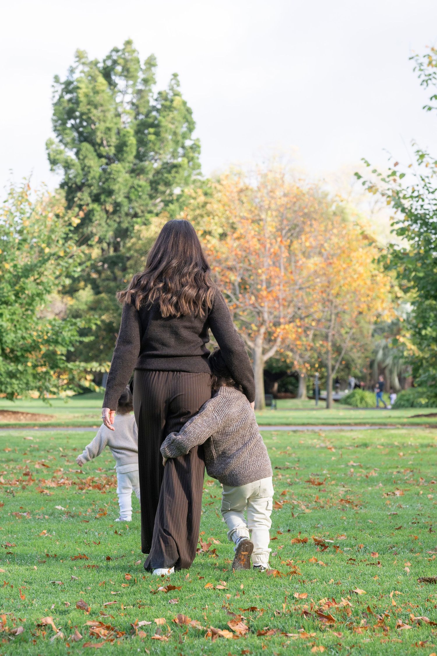
Earthy greens, rusts, creams and warm browns complement the natural surroundings.
Melbourne CBD
City sessions suit a wider range of colours. Neutrals, black, navy and richer tones often pair beautifully with Melbourne's architecture, while softer palettes create a timeless editorial look.
Home Sessions
Choose colours that feel comfortable and reflect your home. Soft neutrals and warm textures often create a relaxed, intimate atmosphere.
The Best Colour Is One You Feel Good In
At the end of the day, confidence photographs better than any colour palette.
If you feel comfortable, relaxed and like yourself, it will naturally show in your photographs. My role is to help guide you, so don't stress about getting everything perfect.
Beautiful photographs aren't created by following rigid styling rules—they're created by capturing genuine moments with the people you love.
Let's Bring Your Vision to Life
Not sure what colours will work best for your session? I'm always happy to help. Once we've chosen your location, I can recommend colour palettes that suit the setting, the season and your personal style so you can arrive feeling confident and ready to enjoy the experience.